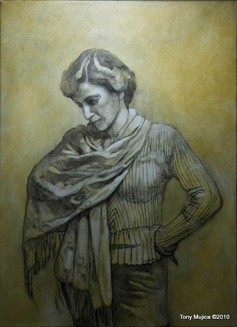
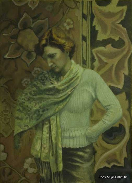
Kathy's Demo
For your interest, I'm posting this demo. I had a lot of fun working with Kathy. Kathy is a fellow artist and photographer. She and I both belong to the same arts group. Because of her photography background, she knows how to pose and has quite a flair at it. Look at that left pinky. When she took her position for this, it was the last of several poses. She posed, as depicted here but, at first, without extended pinky. Then she stuck out her little finger, and I said, "Hold it!" I immediately knew I had a winner of a pose.
The Drawing
The Drawing
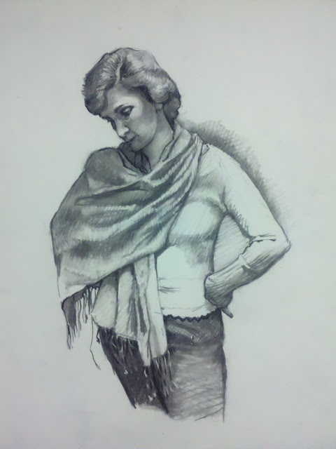 |
| Prelimanary drawing for "Kathy" Charcoal on Mylar 24" x 18" |
This is one of a few drawings that I did of my model, Kathy. Like I stated earlier, I like this pose because of that little finger. The drawing is done in charcoal on double frosted Mylar, which I gessoed on the back side.
Mylar vs. Traditional Paper
Mylar, along with Denril and other polyester papers, is becoming my favorite substrate because of its flexibility for varied uses. Polyester paper has a shelf life that far outlives traditional paper and canvas. I use it for drawing and painting in most media, mostly for painting sketches. I can use it for almost all media. Drawing in graphite, charcoal, even silverpoint (when treated with the appropriate ground), work especially well. I use a suitable fixative to protect the drawing if I decide to continue it as a painting.
Mylar is less expensive than canvas so I can feel free to toss a drawing that isn't working out. But if the original is really a strong piece, I mount the finished work on a board with traditional cradling on the back side.
When I paint on location in a conference setting, I use the Mylar mounted onto a board. This resolves transporting issues that arise if the painting is sold. I just whip out a large mailing tube, roll the dried, unmounted work and insert it into the tube. I let the buyer take care of framing when they get back home.
Stage One
 |
| Stage one |
I transfered the drawing onto canvas. I did so because I wanted the texture, feel, and bounce of stretched canvas. First, I laid in an olive toned imprimatura (an initial paint stain) to bring the white of the canvas to a middle tone. My charcoal drawing laid over the dried olive tone, has been tamed with a medium of special aged oil diluted with a tripled distilled turpentine.
The turps I use is not the horrible variety sold in hardware and art stores. That stuff has so many impurities in it because of the way it's made. It's no wonder so many are up in arms against its use. The triple distilled that I use is a different thing altogether. It is a much purer form. It even smells like pine trees (which is where it comes from). I use it and Spike Lavender for the painting process and making my mediums, but I leave brush cleaning for the mineral spirits. (By the way, those petroleum-based solvents that many "authorities" are saying are better for you because they are odorless, are far worse for your health than good, triple-distilled turpentine. They are promoted on behalf of the petro industry. Turpentine is an ingredient in many cosmetic industry products. It's also in Vick's Vapo Rub. Just thought I'd vent a little. Must be those mineral spirit fumes.)
Here I use the charcoal like I might use a french painting technique called grisaille (griz-eye), building up my darks over which I transition into paint. I build up the layers until I get the contrast I desire. Usually, I go directly into grisaille with paint, but sometimes I enjoy the immediacy and character of vine charcoal.
Stage Two
 |
| Stage Two |
At this point I've switched over to an Italian technique called Verdaccio, which is an underpainting in greens. Verdaccio works really well when portraying redheads with porcelain skintones.
This method goes way back to the early years of painting (the 1400's). The concept is this: drain the blood out of the creature (by reducing skin color to green-tones) and reintroduce the blood later, as you add fleshtones. The green underlayer balances out with the reintroduced flesh color.
I see this as very biblical, because I am reminded of a bible passage that says "the life of the creature is in the blood". So I, as creator of the world within my canvas, take away the life, then resurrect it afterwards.
(Do you remember the painting shows of William Alexander, the predecessor to Bob Ross? He would always say with his dutch accent, "You are the almighty creator for this painting. If you vant red there, you FIRE it right in, on top of the Magic Vite!"
I used to cringe when I heard him talk that way, although I understood what he was trying to say. I am in no way "the almighty". I do not go for the idea that we are gods - I am a creation, not The Creator. This is the closest I ever plan on getting to the role of almighty, but with that said, we are created in His image, right? We share a desire to create. . .and license to destroy. We are patterned after the Lord who giveth and taketh away, so in our creative world we can exercise that.)
Stage Three
 |
| Stage Three |
At this stage of the game with a reintroduction of flesh color. I've started to restore the blood back into the resurrected Kathy . . .and boy, is she relieved!
Stage Four
Stage Four
 |
| Stage Four |
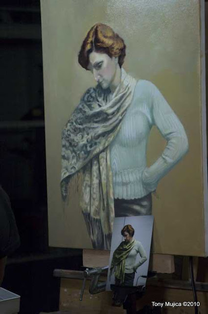
Here I've added an invented background based off of a few image references found on the web. I changed the composition and color of my references, to complement my ongoing color scheme. I am tweaking things to refine and unify the contrast ratio.
Contrast ratio is a ratio, (measured in value steps) established between the darkest dark and the lightest light on any object in an environment. It may be a ratio of three steps between darkest and lightest, or two or four. That ratio remains consistent with all objects under the same lighting in that environment. When this is adhered to in a painting, the overall light treatment becomes balanced and unified. This produces atmosphere. Different types of light sources create corresponding ratios. For example, a spotlight will produce a much different spread of values than north-light entering a room on an overcast day.
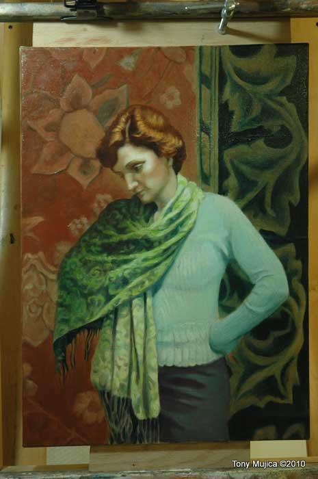
Stage Five
Contrast ratio is a ratio, (measured in value steps) established between the darkest dark and the lightest light on any object in an environment. It may be a ratio of three steps between darkest and lightest, or two or four. That ratio remains consistent with all objects under the same lighting in that environment. When this is adhered to in a painting, the overall light treatment becomes balanced and unified. This produces atmosphere. Different types of light sources create corresponding ratios. For example, a spotlight will produce a much different spread of values than north-light entering a room on an overcast day.
Stage Five
 |
| Stage Five |
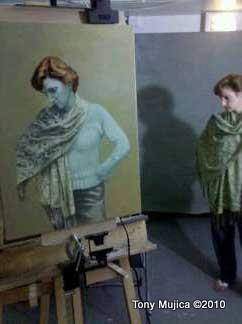
I feel that the contrast ratio works ok here, but it still needs some fidgeting. I will add to this post when I resolve the painting to completion. I will adjust the area behind the treasured pinky, since she was originally painted in front of a blank wall background. Right now it is unresolved. When I am done that should bring some flair to the overall gestalt. If you compare this to Stages One and Three, you'll see how the background change altered the left hand treatment. Painting is an ongoing process of balancing elements within a format. When one thing is altered, other elements need adjustment.
You'll notice wooden bars attached to the top and bottom of the canvas. They are attached to separate the canvas from the top and bottom canvas tray holders. This is so I don't "pull my strokes" when I am painting. Pulled strokes happen when the canvas holders obstruct vertical strokes. These pulled strokes lose the momentum and rhythm that bring flash to a painting. Also notice the C-clamp attached to the top wooden bar. That holds the painting so that it dries properly without a cloth cover clinging to the surface. I tilt the canvas forward for the drying stage between sessions. (The cover is added at the end of the session to protect against any dust accumulation.)
This pose was the last of several, and the one that we decided to explore. Kathy is such a natural as a model (and quite a beauty as well). She instinctively knows what kind of pose to move into. I captured several photos from these modeling sessions. I am planning some silverpoint drawings based on the poses from these sessions. I will definitely use Kathy for further paintings.